Marion Hellweg: Live better with colour
Colours are elementary when it comes to living. They definitely have an impact on our mood and have the power to make each room appear in a different light. In order to make it easier for you to find your way around the currently trendy LIVING COLOURS, we now introduce the best colour shades for your home.
Which colours are currently very trendy? Marion Hellweg discloses her colour favourites – and explains what impact they have on the surroundings.
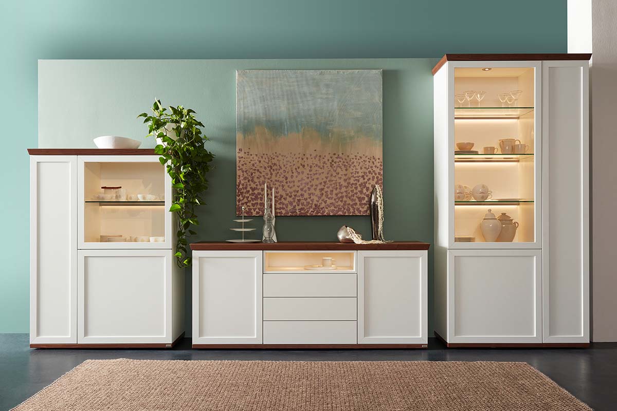
GREY is by no means the grey mouse among the colours – quite the contrary: grey is currently trendier than ever. This is mainly due to the fact that something neutral and beautiful – if you pick the right shade – gives every room a harmonious atmosphere. Grey is the perfect partner for any colour! Especially anthracite makes other colours brighter thus highlighting their impact. Grey is a colour whose spectrum covers everything from elegant to casual.
Effect: the colour shade has a subtly and discreet impact, leaving centre state to other colours. Grey stands for elegance and objectivity.


YELLOW brightens any ambience and brings the sun into the home. Being surrounded by yellow shades will instantly get you into a better mood – and seems to increase the temperature. The optimistic effect of yellow instantly turns the hallway, living room and home office into a fun oasis of well-being. In combination with anthracite and other grey shades, yellow creates a brilliant impact. My favourite shades are mustard, honey, saffron and curry.
Effect: yellow is the colour of light and warmth and has an inspiring and mood-lifting impact. Yellow stands for alertness, creativity and love of life.

BLUE is a colour that many people associate with the sky and the sea, although in nature, the shade appears only rarely. What we perceive as “blue“ are rather light reflections and ambiences. As a colour, light blue visually extends rooms, thus ensuring a clear and relaxed atmosphere. Darker shades such as night and deep-sea blue increase the feeling of total balance and deep satisfaction.
Effect: blue has an extremely calming and relaxing effect. The shade is perfect for finding inner peace and reducing stress and a hectic pace. Blue stands for harmony and silence.


GREEN is currently becoming the most favourite colour, because of its closeness to nature and its ability to create a natural overall look. This versatile shade is particularly suitable for rooms where you want to relax. Sustainable materials such as sisal, linen and wool as well as wooden furniture are the perfect companions for the trend colours, sage, olive and reed green. Tip: simply try a mix of lighter and darker matt green shades.
Effect: Green is the colour of the centre. With its complete neutrality among all extremes, it has a calming effect without being tiring. Green stands for tranquillity and stability.


BROWN is a true star when you want to create a comfortable atmosphere, which is why it is very popular: it creates a natural feel and can be perfectly combined with furniture made from wood and stone. Depending upon which colour you combine brown with, you can achieve different impacts: brown together with a subtle blue create an inviting look. A mixture with berry colours produces a mysterious effect. A stunning combination is mocca with petrol: together they provide a very elegant, stylish duo.
Effect: the natural shade has a protective, friendly and down to earth feel. Brown stands for cosiness and security.


PINK has grown up. Especially in combination with natural materials and copper, it produces a contemporary, feminine look. The subtle and calm feel of the mixture of white and red is particularly suitable for living rooms and bedrooms. To create a gentle ambience, choose a combination with beige, sand or vanilla shades. My current favourite colours are: powder, rosewood and blush.
Effect: pink promotes tranquillity and has a calming effect. Subtle shades in the bedroom even help with sleep disorders. Pink stands for love, gentleness and care.


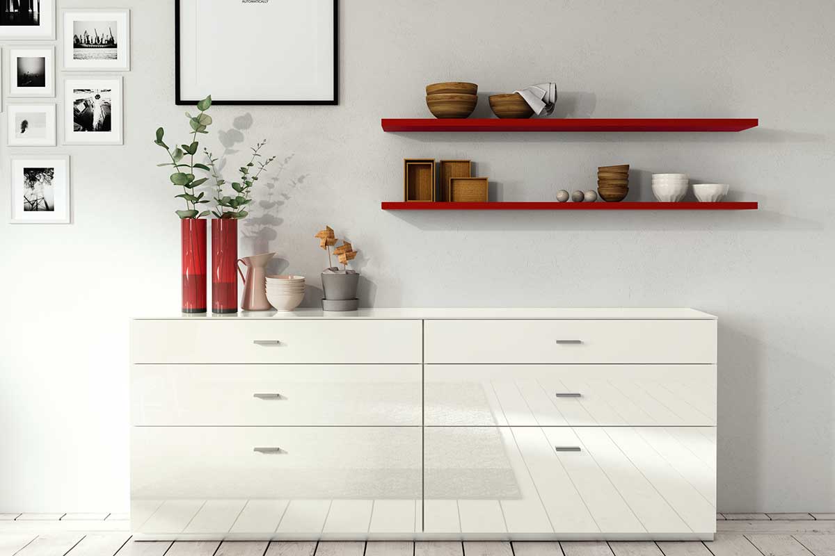
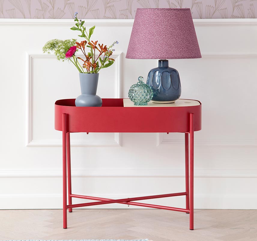
RED is used to add vibrancy, because of its soothing and warming effect. In short: furniture and walls in red add an exclamation mark and transform any room into an impressive stage. By the way: even the perception of this colour increases the human metabolism – another reason to decide upon a highlight in red in your home. Currently, mainly shades such as coral red and salmon red are trendy, as they can be perfectly combined with feminine rouge and powder shades.
Effect: red has a sensual, warm and energetic impact. This bold colour stands for vitality and activity.

VIOLET is an eye-catching colour that adds original accents. Trendy shades such as lilac and lavender create a confident, feminine elegance and perfectly match the modern country house style. Friendly violet ensures a good mood but should always be combined with muted colours such as taupe, cream or beige in order to avoid producing a slightly cheesy look. My tip: if you love a casual modern feel, combine soft violet with pink, mint and pastel green.
Effect: this mystic shade is a mix of the invigorating energy provided by red and the calming feel of blue. It has a glamorous, mysterious and unconventional impact. Violet stands for magic and inspiration.


WHITE is the queen of colours in a living area if you want to create a neutral background. In front of white furniture and walls, the key players take centre stage, whether they are bold or subtle colours. Generally, white creates a sense of space and clarity in any room. In order to ensure that the ambience does not appear boring, simply add small details such as darker individual pieces or colourful accessories to add excitement.
Effect: white has a simplistic, bright and light impact. This most neutral of all shades stands for purity and neutrality.


BLACK No colour is as dark, which is why every other colour next to black seems to glow. In order to ensure that deep black surfaces (and walls) do not swallow too much light, simply combine them with lighter furniture and accessories that radiate warmth and reflect the light – i.e. units made form light wood or metal: they are perfect for achieving the best from black.
Effect: black provides a big contrast and puts other colours centre-stage. Black stands for elegance, a modern feel and objectivity.